ePoster Gallery 1/2023
‘Seeing red’ – the use of a warning colour in posters
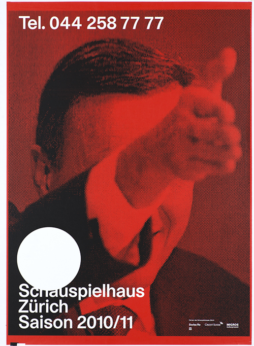
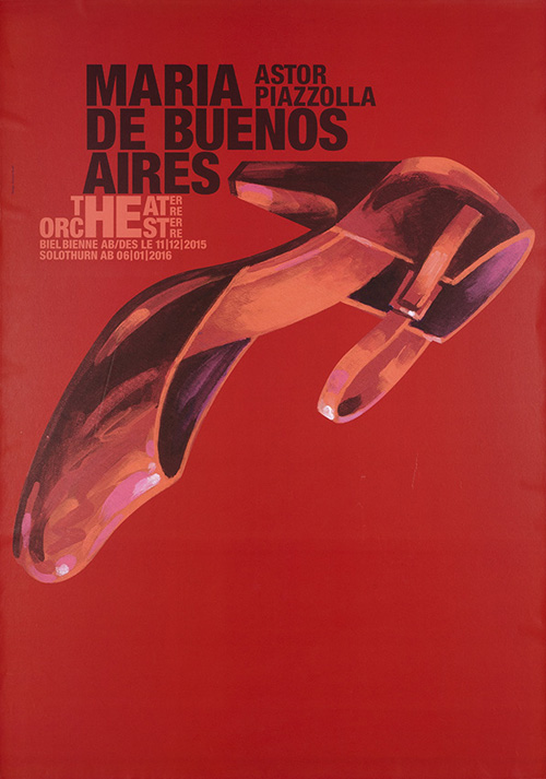
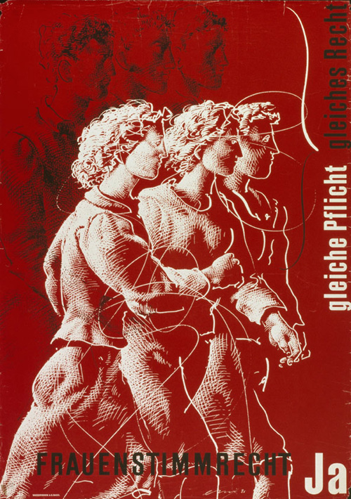
Examining posters for their use of a certain colour invites you to take another look at their design. Red, as a strong colour, is used with particular frequency because the human eye reacts very sensitively to this colour stimulus. The diversity of the names given to its myriad shades, such as fiery red, blood red and bright red, underlines the broad range of its symbolic power. Red is perceived as warm and passionate, and is linked with courage and strength. However, it also stands for aggression and rage, and is often used as a warning colour. These connotations are also reflected in common parlance, such as in the phrase ‘seeing red’ or the internationally used expression ‘like a red rag to a bull’.
In a brief interview, Nico Lazúla, archivist at the Museum für Gestaltung Zürich, explains why the choice of posters was not easy, and what makes red particularly stand out.
Was it difficult to put this particular selection together?
Yes and no. No, because there is a multitude of posters in the collection that make extensive use of this bright colour. Yes, because it wasn't easy to choose from such profusion. It was important to me when compiling them to gather all the different poster categories together and to illustrate the colour’s various symbolic levels of meaning. This means we can really demonstrate and distil the way the colour has been handled, and the way different aspects have been emphasised.
What stands out about the way the colour is handled?
A variety of interplays between the three colours black, white and red, or sometimes just two of them, characterises the poster design of the early modern period in the 1930s. Typographers and graphic designers capitalise on the visual allure that the combination of red with black or white develops. However, they are also very taken with the objective rigour that results from dispensing with any other bright colours.
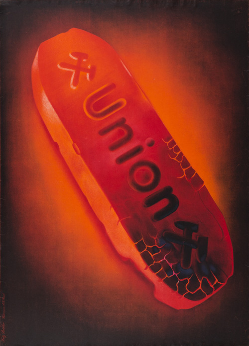
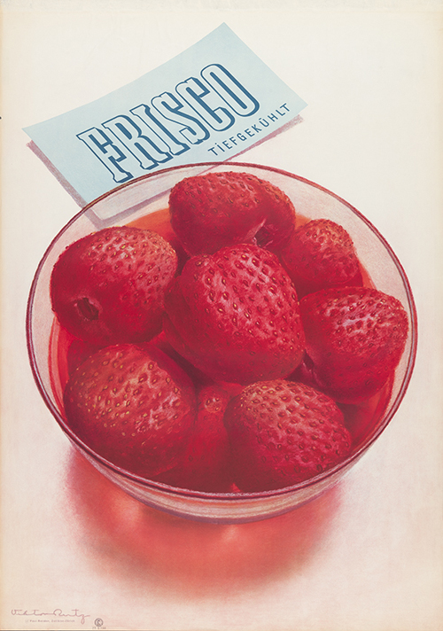
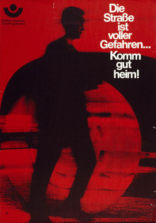
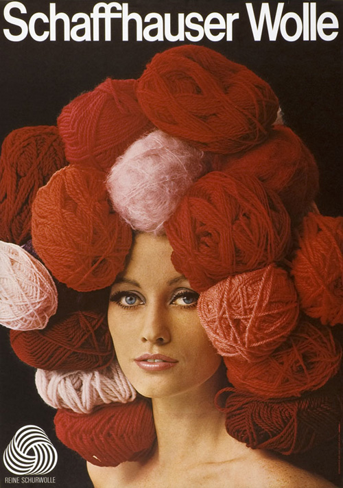
The colour red has been used in all categories of poster, right up to the present day. Desirable products either gleam in glowing red themselves or are presented in front of a red background. The fluffy ball of wool on the woman's head, the juicy strawberries or the glowing coal briquette radiate a tactile sensuality that is largely thanks to the colour. It is also used as a warning colour in prevention posters and traffic safety notices to alert people to a danger or hazard. So, early on, advertising employed both the visual and the psychological impact of this colour in order to catch the attention of passers-by among the flood of visual stimuli.


Mangeront‑ils? Comédie de Victor Hugo – Théâtre Vidy
Photo: Mario del Curto
Design: Werner Jeker
Posting date: 2002
www.secours‑d‑hiver.ch
Design: Ecole d'arts appliqués / Sophie Rogg www.secours‑d‑hiver.ch
Posting date: 2007
Union
Design: Fritz Bühler, Otto Glaser
Posting date: 1943
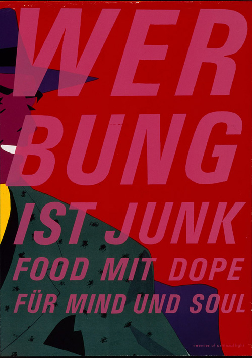
Werbung ist Junk Food mit Dope für Mind und Soul
Design: Kurt Thaler
Posting date: 1991
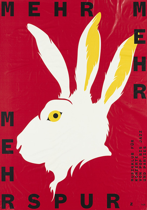
Mehr Mehr Mehrspur
Design: Benjamin Burger
Posting date: 2014
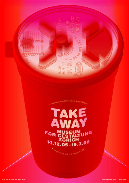
Take away – Museum für Gestaltung Zürich
Design: Martin Woodtli
Posting date: 2005
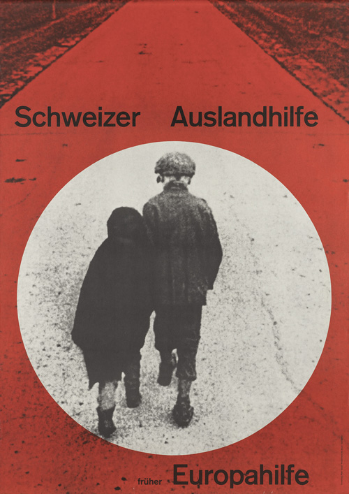
Schweizer Auslandhilfe – Früher Europahilfe
Design: Celestino Piatti
Posting date: 1959
Frisco – Tiefgekühlt
Design: Viktor Rutz
Posting date: 1944
Gefahr erkannt – Gefahr gebannt – Die Strasse ist voller Gefahren... Komm gut heim!
Design: Werbeagentur Günter Bläse / Gerhard Weidig
Posting date: around 1965
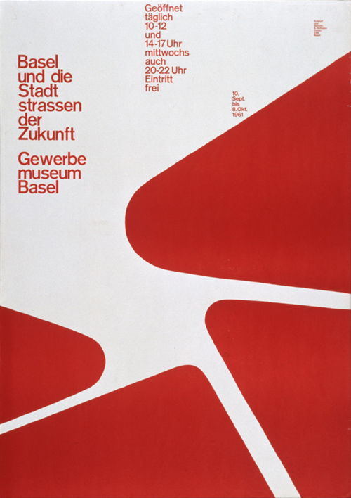

Basel und die Stadtstrassen der Zukunft – Gewerbemuseum Basel
Design: Armin Hofmann
Posting date: 1961
Das Therma‑Eisen schont Ihre Hand
Design: Anonym
Posting date: 1939
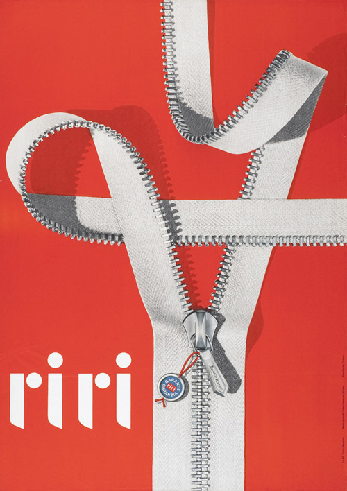
Riri
Design: Hansruedi Widmer
Posting date: 1958
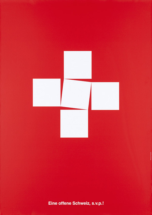

Eine offene Schweiz, s.v.p.!
Design: Niklaus Troxler
Posting date: 2016
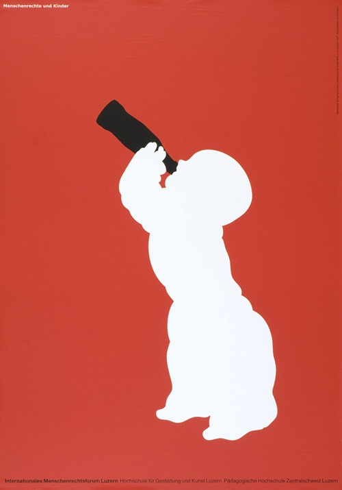
Menschenrechte und Kinder – Internationales Menschenrechtsforum Luzern – Hochschule für Gestaltung und Kunst
Design: Wolfgang Schoeck
Posting date: 2007
Nie wieder Krieg
Design: Romy Weber
Posting date: around 1967 (Reprint 2014)

Vous qui voulez éviter le sabotage de nos institutions démocratiques, vous qui voulez le progrès dans l'ordre, votez "vert", votez la liste radicale!
Design: Anonymous
Posting date: 1930
Schaffhauser Wolle
Design: Hans Looser AG Werbeagentur / Hans Looser, Jost Wildbolz
Photo: Hanspeter Mühlemann
Posting date: 1965
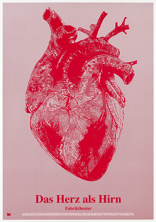
Das Herz als Hirn – Fabriktheater
Design: Eric Andersen
Posting date: 2017
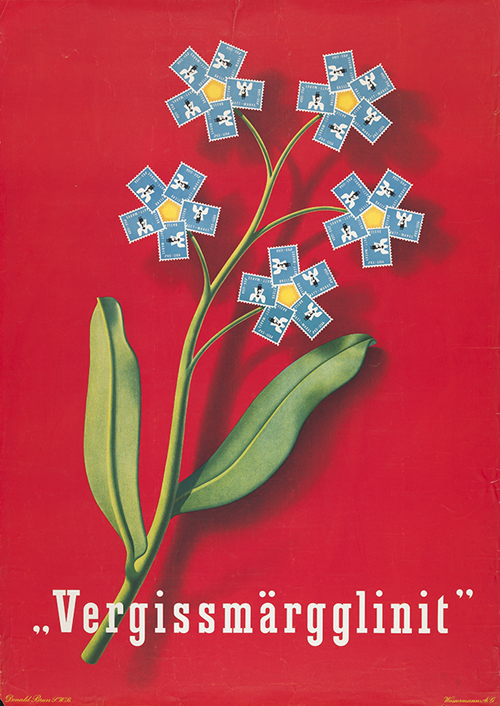

"Vergissmärgglinit"
Design: Donald Brun
Posting date: 1943
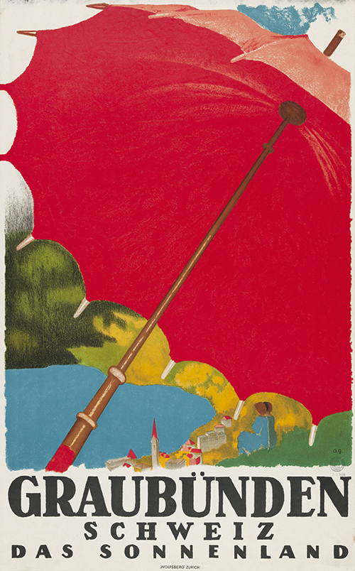
Graubünden Schweiz – Das Sonnenland
Design: Augusto Giacometti
Posting date: 1924
Hotel Waldhaus Dolder – Zürich
Design: Willi Trapp
Posting date: 1935
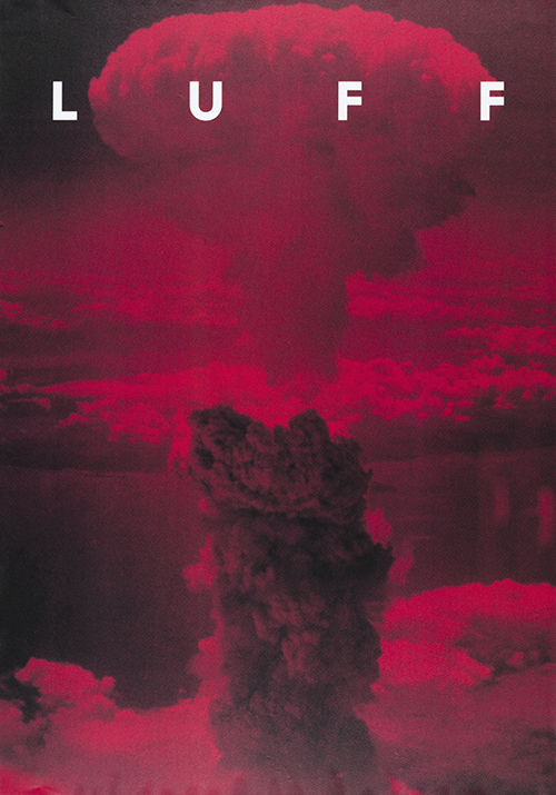
LUFF
Design: Demian Conrad Design / Demian Conrad
Posting date: 2011
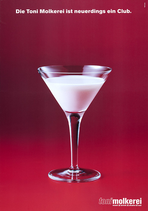
Die Toni Molkerei ist neuerdings ein Club. Toni Molkerei
Design: Ruf Lanz Werbeagentur AG / Danielle Knecht‑Lanz, Markus Ruf
Posting date: 2002 (Reprint 2016)
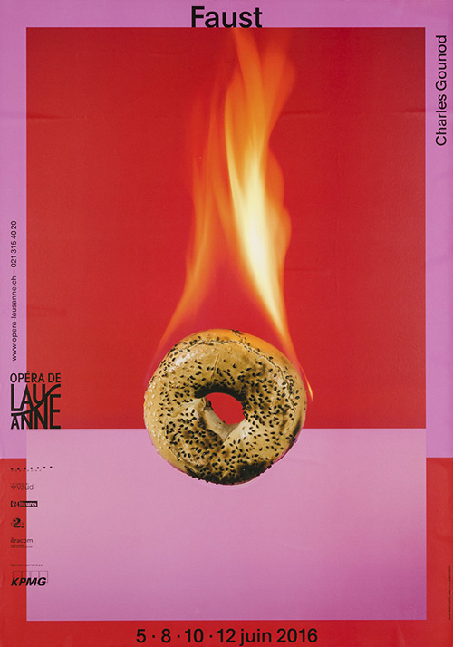
Faust – Charles Gounod – Opéra de Lausanne
Design: Bhakti Devanthéry, Pauline Chanel, Benjamin Maibach
Posting date: 2016
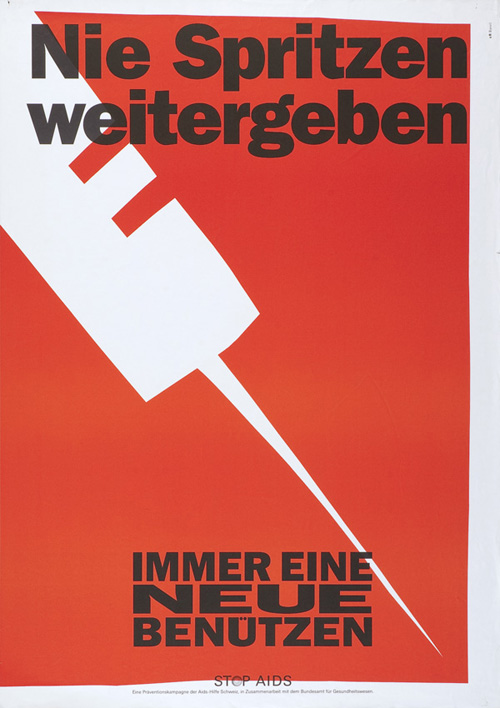

Nie Spritzen weitergeben – Immer eine Neue benutzen – Stop Aids
Design: cr Basel Werbeagentur AG
Posting date: 1990
1. Mai – Demonstration – Kundgebung – Fest
Design: Fabian Muñoz Diaz
Posting date: 2004
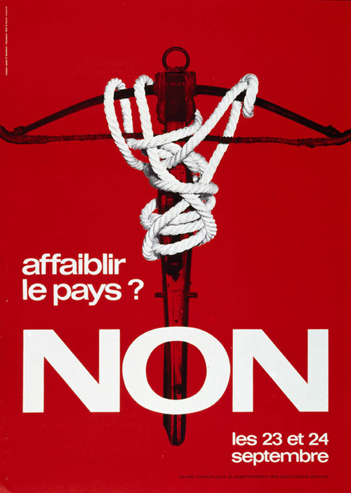
Affaiblir le pays? Non
Design: Atelier Bataillard / Pierre Bataillard
Posting date: 1972
